
How to Build a Shopify Giveaway Landing Page That Converts (Not Just Looks Good)
Building a giveaway landing page on Shopify will determine the success of your campaign, because the page is where every visitor decides whether to enter or leave. You can run great ads and send a…
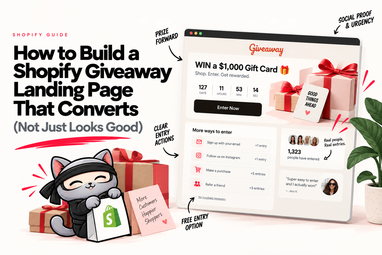
Building a giveaway landing page on Shopify will determine the success of your campaign, because the page is where every visitor decides whether to enter or leave. You can run great ads and send a strong email, but if the page they land on only collects a name and an address, you've built a list that goes cold a week after the draw.
Built right, your Shopify landing page is the conversion layer of the whole giveaway, where it displays the single page where entries, purchases, and referrals all happen. This guide covers what the page is for, the elements that actually move the needle, the entry mechanics most pages miss, and how to build one on Shopify.
What a giveaway landing page is, and the one job it has
A giveaway landing page is a single page built to promote one contest and capture entries. It carries the prize, the entry actions, the rules, and the form, with nothing else competing for attention.
The one job is conversion. Every visitor who lands here should understand the prize in seconds and take one action to enter. A homepage can't do that job, because it's built to send people in ten directions. A dedicated page sends them in one.
That focus is why a giveaway landing page beats running the promotion off a blog post or a social bio link. One page, one prize, one action.
The anatomy of a high-converting giveaway page
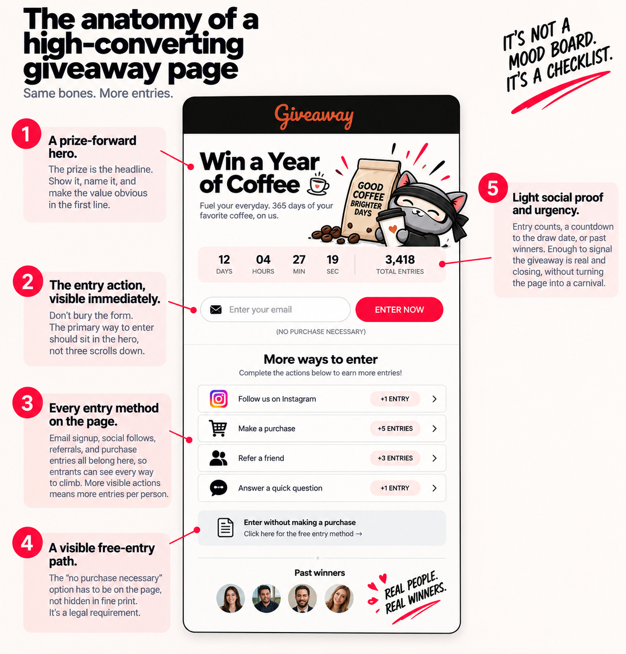
The pages that convert share the same bones. Not a mood board, a checklist.
A prize-forward hero. The prize is the headline. Show it, name it, and make the value obvious in the first line. "Win a Year of Coffee" works because there's no guessing what's at stake.
The entry action, visible immediately. Don't bury the form. The primary way to enter should sit in the hero, not three scrolls down.
Every entry method on the page. Email signup, social follows, referrals, and purchase entries all belong here, so entrants can see every way to climb. More visible actions means more entries per person.
A visible free-entry path. The "no purchase necessary" option has to be on the page, not hidden in fine print. It's a legal requirement, and we'll cover why in a moment.
Light social proof and urgency. Entry counts, a countdown to the draw date, or past winners. Enough to signal the giveaway is real and closing, without turning the page into a carnival.
Get these five right and the design choices around them matter far less than most guides suggest. Also, this giveaway analysis on Reddit can be helpful.
The part most landing pages get wrong: entry mechanics
Here's where a Shopify giveaway page can pull ahead of a generic one. Most landing pages treat every entrant the same: one email, one entry, done. That builds a list, but it leaves the revenue on the table.
Connect the page to your store and you can weight entries by what matters to your business.
Purchase-based entries. Every order earns entries, so the giveaway drives sales instead of just signups. This is the single mechanic that turns a landing page from a cost into a channel.
AOV boosters. More entries for bigger orders, or an optional entry pack that multiplies odds. Basket size climbs because customers choose to spend more for a better chance.
Referral entries. A bonus for every friend who enters through someone's link. Each entrant becomes a small acquisition channel with a personal stake in your reach.
The follow and the email field still do their job. The store actions do the job a design-only page never could.
Keep the page compliant, on the page itself
Two rules keep a giveaway legal, and both live on the landing page where entrants can see them.
The free-entry path. In most regions, you can't make a purchase the only way to enter. That crosses into an illegal lottery. Purchase can earn bonus entries, but a free method always has to be available and easy to find.
Coffee Bros does this cleanly on their espresso machine giveaway page. Anyone can enter free through the signup form, and they publish a mail-in alternative with the same odds for people who don't want to sign up online. The free path is stated plainly, not tucked away.
Clear rules. State eligibility, the regions you're open to, and the draw date up front. A rules generator handles the wording in a couple of minutes, and clear rules protect you if a result is ever questioned.
One destination, every channel points to it
A giveaway landing page earns its value when it's the single place every channel sends people. Email, paid ads, your social bio, QR codes on packaging, an influencer's link. All of it lands here.
That matters because scattered entry points scatter your data. When everything funnels to one page, every entry, source, and referrer feeds one pool, and you can actually see which channel drove the campaign. As the Giveaway Ninja playbook puts it, the strongest hero campaigns point every channel at the same landing page.
So before you launch, decide the page is the hub. Then wire every promotion back to it.
Case study: Coffee Bros
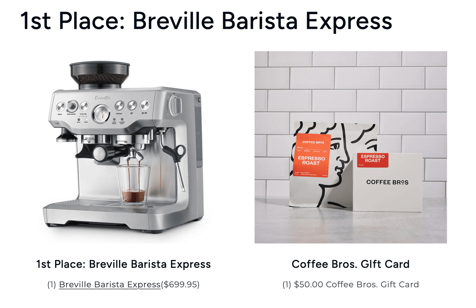
Coffee Bros runs a recurring espresso machine giveaway built around a single landing page. The prize is a brand-new machine, and the page keeps the entry path simple: sign up with the form, then earn extra entries by referring a friend, following on Instagram, or sharing the contest.
The prize does the filtering. An espresso machine speaks to exactly one audience, people who take coffee seriously, which is the same audience that buys Coffee Bros beans. Nobody enters this giveaway who doesn't already want what the brand sells.
The page also handles compliance without friction. The free signup is the main path, and a mail-in option with equal odds sits right in the rules, so the giveaway stays legal while staying easy to enter. It's a clean example of a landing page doing all its jobs at once: capture, filter, and comply.
How to build one on Shopify
You have three ways to put a giveaway page live on a Shopify store.
Embed it with a widget. Drop the giveaway onto an existing page or a new one through a launch widget, so it lives natively on your store.
Host a branded landing page. Run the full page on your own domain, styled to match your brand, as the destination every channel points to. A page builder like GemPages can help you to build one.
Use a direct campaign link. Share a hosted campaign URL from email, ads, or social when you don't need it embedded on your store.
Whichever you choose, the setup is the same underneath: pick the prize, turn on your entry actions including purchase-based entries, add the free-entry path, and connect the page to your email stack so entrants flow straight into your follow-up. Giveaway Ninja runs all three formats and handles the purchase-entry and compliance layers for you.
Build the page to convert, not just to look good
A giveaway landing page that stops at a pretty hero and an email field gives you a cold list. One built with visible entry mechanics, purchase-based entries, and a compliant free path gives you a bigger cart during the campaign and an audience you own after it.
Lead with the prize, show every way to enter, keep the free path visible, and point every channel at the one page. That's the difference between a page that looks good and one that pays for itself.
Want it mapped to your store? Book a call and we'll build the page, entry stack, and timing around your margins. Or grab the BFCM Playbook PDF for the seasonal version of the model.